THE NORTH POLE GNOME
WEBSITE DESIGN
Project Title
The North Pole Gnome E-Commerce Website
Concept
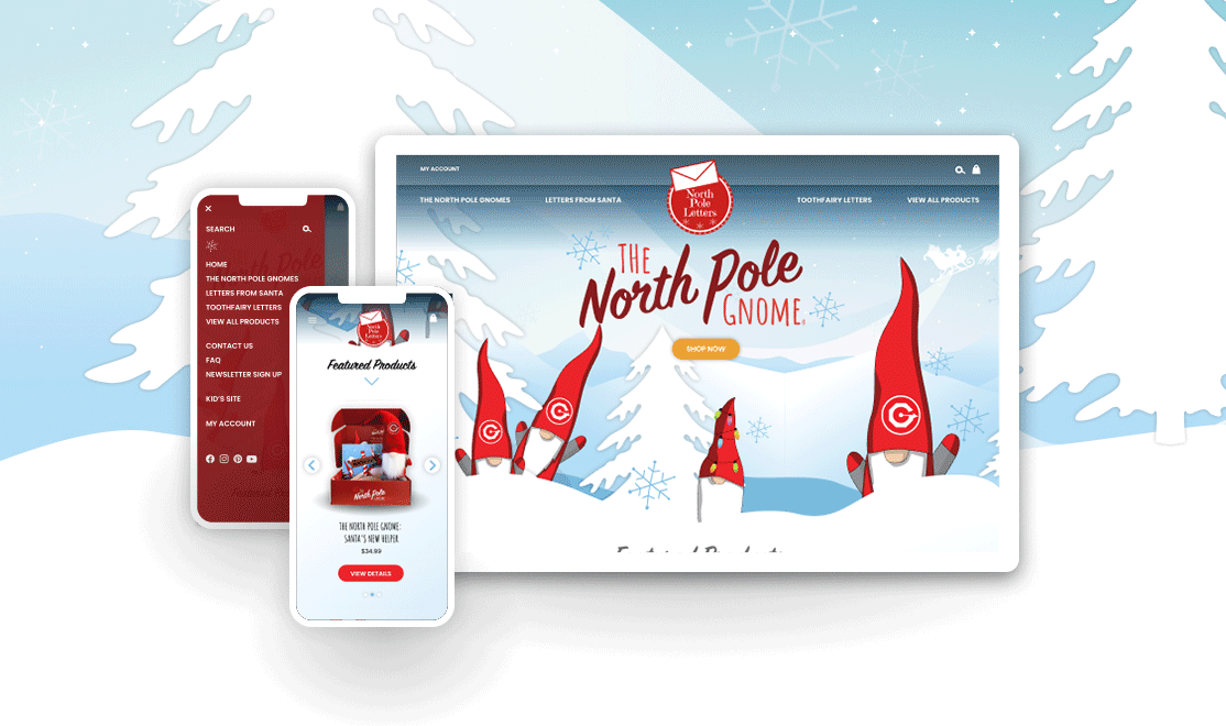
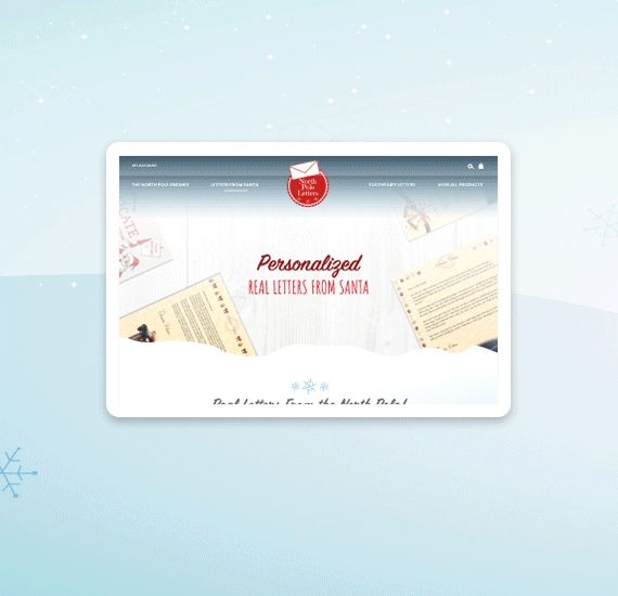
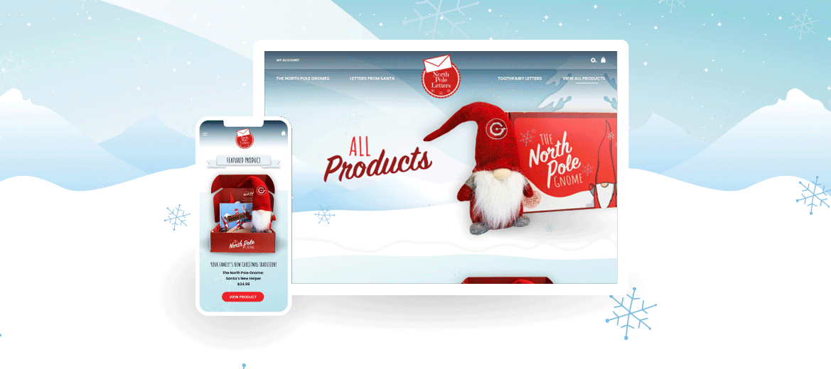
North Pole Letters wanted to revamp the look of their former e-commerce website for North Pole Letters. My goal with this project was to create a consistent, branded-look, carrying it from existing marketing materials into a new, clean and fresh website. I sought to create a modern, yet kid-friendly look that would allow the products to stand on their own and pop against the created designs and graphics. A chosen color scheme of soft blues allowed for this look, contrasted with pops of red to indicate brand emphasis in select areas. Focusing on consistency, fun graphics were implemented across the website, inspired from the children's book illustrations. Functionality and clarity was a main focus as I developed the mockups, organizing the page layouts and structure in a way that would lessen consumer confusion and allow for visual ease when browsing products.
My Design Role
I am responsible for various aspects of design in creating the North Pole Gnome brand. This includes, the logotype for the North Pole Gnome, box packaging, color scheme selection, fonts chosen, created snow background and graphics, website design and Amazon StoreFront. After creating the various mockups and instances of consideration for the website (full-encompassing visuals), a team of developers developed and coded the site.
* I did not design the actual products being sold through the website or the North Pole Letters Logo
Discipline
Web Design, Mobile Design, Visual Design (UI/UX), Prototyping, Graphics & Assets for Web
Software
Figma, Adobe Illustrator, Adobe Photoshop
Client
North Pole Letters